Sunday, July 29, 2007

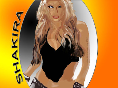
Shakira ver 2.0 : )


Over a year ago I drew Shakira using lines only, so today I thought I could do a better job at this and made another Photoshop drawing of Shakira. [Note: this drawing is property of Nael El Shawwa]
Like the drawing of Ali you can follow the same pointers given there to produce a similar effect. Ali's hair is not as fancy as Shakira's so this part is the trickiest to do. My advice is to divide the hair into several layers: (1) a solid color for the hair, pick a colour that is common in the hair. (2) draw some thick highlights on another layer on top of the first. (3) draw thinner highlights on top of the thick ones. (4) Using the blurring tool, blur the highlights on both layers to create a more hairlike effect. Repeat this step until you are satisfied with the "hairy" layers.
The second trickiest part were the "boobs". My only advice is trial and error until you produce the boobilicious effect!
Wednesday, July 04, 2007

Photoshop Vector Cartoons

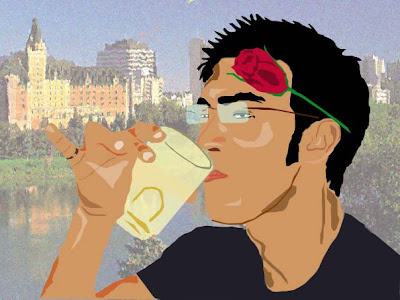
I first started drawing these cartoons around two years ago [see the Photoshop labels for other posts like this]. Today I started a new type of Photoshop art called vector drawings. Its not really difficult to do, just needs an eye for colors. For example, I did this cartoon of my cousin Ali - he does not wear a rose on his ear, but I thought it would be hilarious if he did.
So here is a simple tutorial how to do this:
  1. Pick a photo you wish to vectorize
  2. Plan which parts will go on what layer. A good vector cartoon needs to be organized
  3. Use the brush, or the pen tool (I like the pen tool) trace out all the skin layer and give it one solid color for the skin. This will look like a blob at first.
  4. Do the same for the hair on another layer, on top of the skin layer
  5. And again the same for any other props like the glasses or the rose or the cup - each on a separate layer so you can control what goes on top of what in the image
  6. When dividing the layers, you can also use multiple layers for the same item. For example, in the drawing above, the frame of the glasses, and the lens are on separate layers. This allows me to add transparency to the lens so we can see the layer underneath it
  7. Add some shadows and lighting on different layers to make it more realistic. Keep them separate.
  8. One thing I did not do in the image above, is add facial lines. These are important to capture the person's expression
  9. Practice
  10. Be creative!
Hope that was useful!
Cheers